
The Challenge
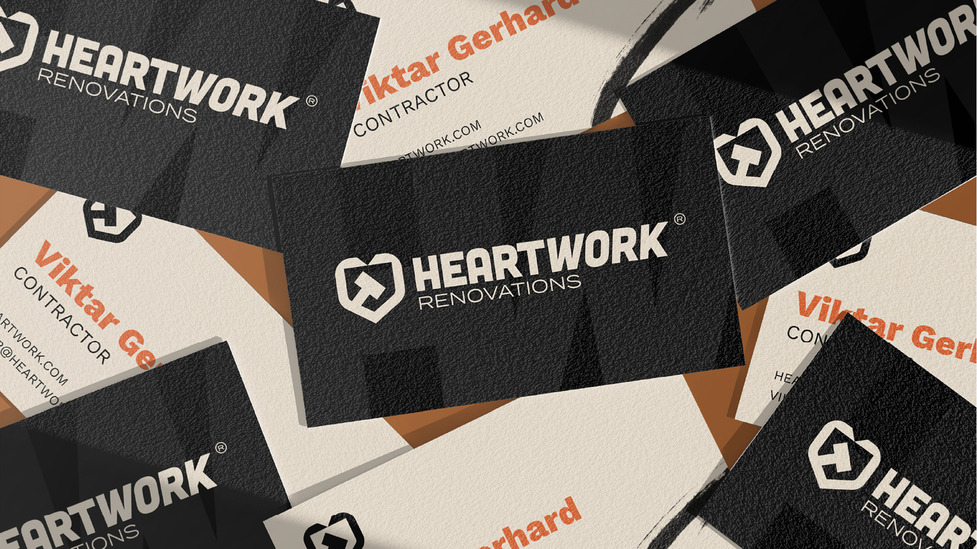
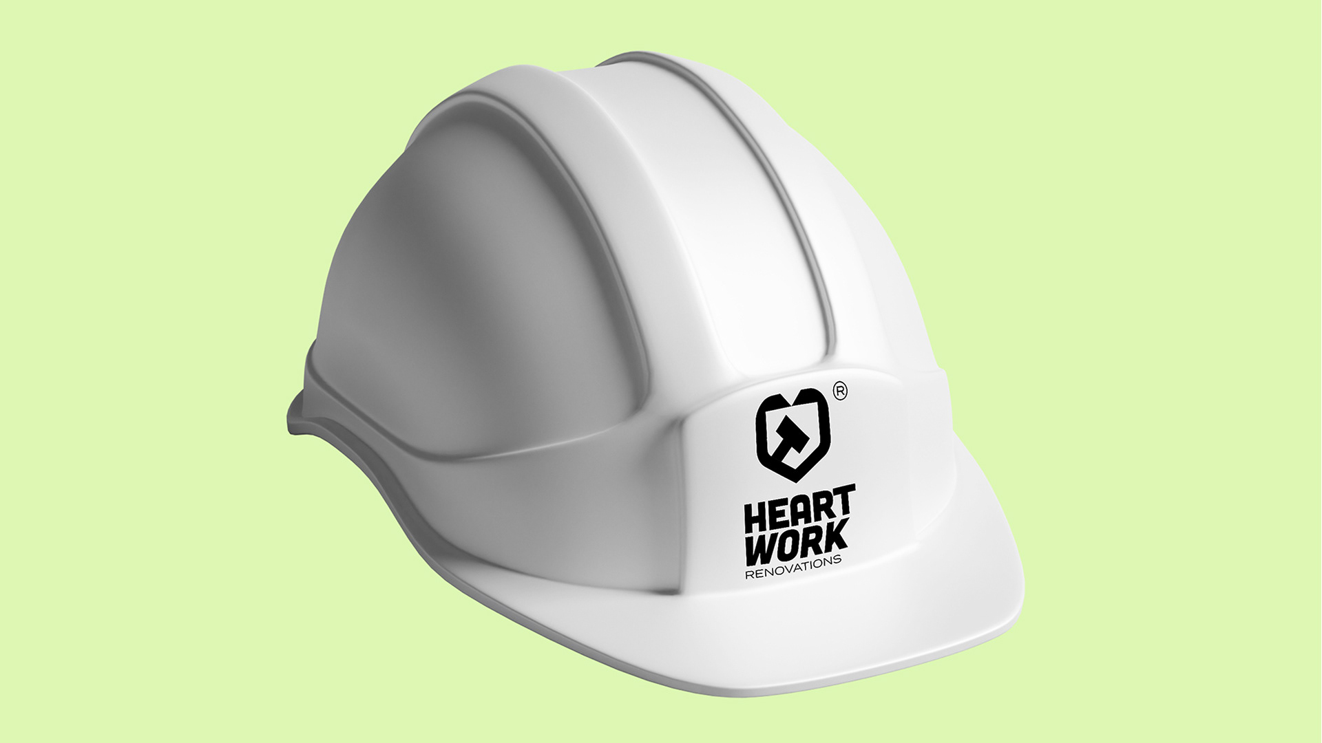
Heartwork Renovations was started by one of my buddies from high school. He has felt like home improvement done by professionals has become unaffordable for the average person. I think a mission like that resonates with us all as the price of everything becomes more and more expensive. The biggest challenge with this brand was Heartwork was a pretty brand new business. Working with brand new businesses can be tough because they sometimes don't have enough experience to know who they are yet. Another challenge is how do you incorporate the 'heart' in heartwork visually. You don't want it to soften the brand too much if you do include it, but you want those vibes to still be present.
The Solution
To kick off working together we started with visualizing what we want to see Heartwork look like in 2-5 years because the business is so new. I then walked him through some brand strategy to put a some specifics around the vision. He had already come up with the tagline of "Putting the heart back in hard work" which is a beautiful phrase to anchor the brand around. For this project I felt like the name ‘Heartwork’ was a perfect opportunity for a mashup mark of a heart symbol and a work symbol of some sort. We wanted it to be very obvious when you see the logo what is going on. This is another tool that can be used with new businesses to get future consumers to know exactly what the business does.
The Work
-Brand Strategy
-Visual Identity System
-Motion Design